|
"Surveys, Overlays, Adjustments and Revisions"
by Allan Brown
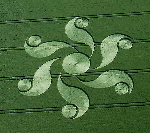
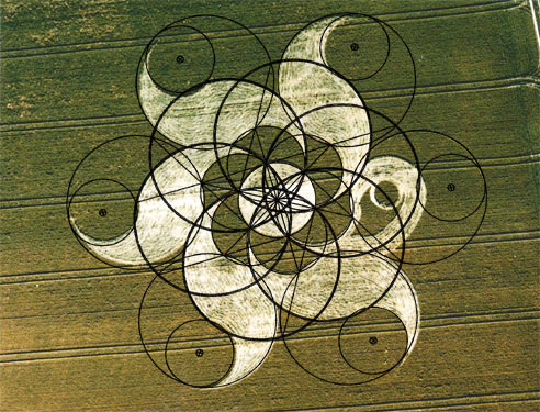
1/ AERIAL PHOTO OF FORMATION
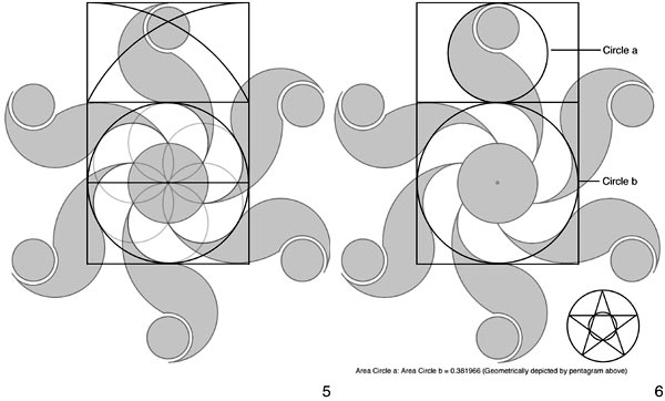
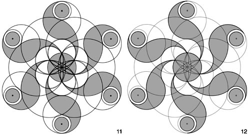
When I begun work on this formation I noticed that the simplest methodology for
describing its geometry, when rendered, did not appear to accurately overlay the
aerial photograph. I therefore began to look for a coherent geometrical reason
for why this may be. Drawing on both my initial attempt, in which 'circle a' was
ascribed a diameter of 5 units, and 'circle b' a diameter of 8, (see Phi
Analysis) and an analysis by Zef Damen in which he arrived at a similarly
proportioned set of circles, although coming at it from a different perspective,
I looked to see if the formation was actually alluding to a true Phi based
proportion, and the phi based construction sequence below shows how this would
work. This Phi based methodology appeared to overlay the aerial photograph with
a fair degree of accuracy.
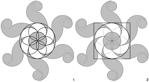
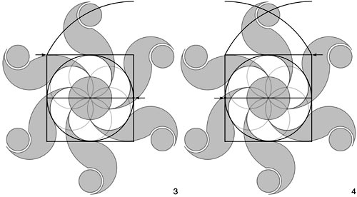
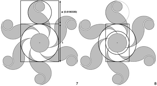
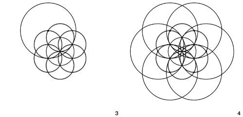
2/ PHI BASED CONSTRUCTION SEQUENCE (1,2,3,4 &5)
Having spoken to Nick Kollerstrom. who expressed surprise at this apparent phi
proportioning, as it seemed at odds to him when compared to the normal
methodology utilised in crop circle design, I decided that I would survey the
formation when next passing through Wiltshire, which happened to be after
visiting Stonehenge for the Summer Solstice. (Big up to Jenny Venus, Tragic
Roundabout's trumpeter and the wandering minstrel who entertained us with a
medley of fantastic tunes!) Measuring up formations is always a bit of a chore,
especially as time is normally at a premium and the temptation to just lie down
in the middle and relax is ever present. However, in terms of gaining an
understanding of what is really going on with a formation it is an invaluable
exercise, and I must encourage more people to roll their sleeves up do this
vital work as without it our efforts in understanding the geometric nature of
any particular formation is compromised. I also guarantee, alas, that it will
result in you, at some stage, getting quizzed by the police as passers by will
immediately assume that you are in the process of making a crop circle and will
call the police in a blind panic. (I might add that the police have never
responded with such speed whenever I've had cause to call for assistance in the
past. If you are being murdered you would be far better advised to phone 999 and
say that there is someone making a crop circle then you would to relay the true
nature of your predicament! ( I am being facetious.) This has happened to us
repeatedly in Sussex, the last being a true classic as the police man waded
across the field, totally failing to use the tramlines in his haste to get to
us, and as a result damaging more crop then the formation itself.
Another illuminating aspect to surveying formations is that it sensitises you to
the very real difficulties involved in holding a tape still and taut over long
distances. It is also very difficult to survey a formation accurately especially
in most cases you have no idea as to what the overall shape of what you are
surveying is, as aerial photographs are normally only available after the
initial survey has been conducted. Ideally you need to do an initial survey,
then go back and draw it up and wait for the availability of an aerial photo.
After laying an idealised version of the geometry over the aerial photograph it
is worth going back to survey the formation again, this time with an overview as
to the nuances of the geometry and how they relate to the formation on the
ground. Despite having surveyed dozens of formations, and having drawn up a
couple of hundred more, I feel I am still only just starting to become familiar
with the subtleties involved and how to begin adjusting the idealised geometry
into one in which the idealised line of the computer has a certain thickness on
the ground and thus subtly expands or contracts certain elements away from their
idealised positions.
After having measured up the Honey Street formation with Andy Thomas, I could
see straight away that it did not appear to fit my phi based analysis on the
ground. Notice in diagram 10, which shows the idealised phi based geometry
overlaying the aerial photograph, that the flower of life circles in particular
do not accurately follow the contours of the formation on the ground. The fact
that there is significant degree of variation in the sighting of the small
circles, held in the crescent tips of each of the six arms, exacerbates the
difficulties in unpicking the intent of the geometry utilised. However, after
several weeks of playing around with this formation, I think I have a better
idea as to what is going on with it geometrically. In the construction sequence
shown below I show how the initial flower of life is actually adjusted by
ascribing a 1/2ft thickness to the idealised line. In this case the line is
pulled inwards from the idealised line, making the on the ground circumference
subtly smaller than its idealised counterpart. In some formations the line is
pulled outwards from the ideal whilst in others the thickening seems to push the
idealised line out equally on both sides. Some formations seem to incorporate
all three methodologies. Michael Glickman has spoken extensively about these
path thicknesses, as he maintains that the complexity of many formations are
significantly increased by the adoption of thick enough paths that enable us to
enter into and move around any particular formation with ease, rather like the
creation of human scaled labyrinths. I concur with his view and the latest
formation at Coombe Abbey is a fantastic example of the subtleties involved in
harmonising path thickness with the idealised model.
In the Honey Street formation, the increase in the path thickness, pulls the
subsequent geometry that unfolds from this initial flower of life slightly off
true, and when my idealised model is suitably adjusted to accommodate this
discrepancy, it overlays the aerial photograph with a much greater precision.
3/ ACTUAL CONSTRUCTION SEQUENCE
In the diagram below I highlight all the construction points that would be
required to create this formation and in terms of conception this is a
remarkably well thought out design. It certainly references the geometry of the
Golden Ball Hill formation from 2000, which was a formation that I personally
never really liked, even though geometrically it was again a remarkably coherent
idea. (In the case of the Golden Ball Hill formation the actual path thickness
appears to have been extended out from the ideal as opposed to contracted in as
we find in the Honey Street formation. The diagram below shows the adjusted
geometry overlaying an aerial photograph of the formation and one will note that
what is manifest on the ground deviates noticeably from the ideal overlay.
4/ GOLDEN BALL HILL (Photo Overlaid)
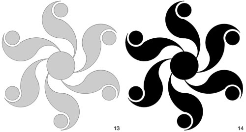
The geometry of the Honey Street formation is simpler than that of Golden Ball
Hill, but I think, aesthetically, it works far better as a result. It is
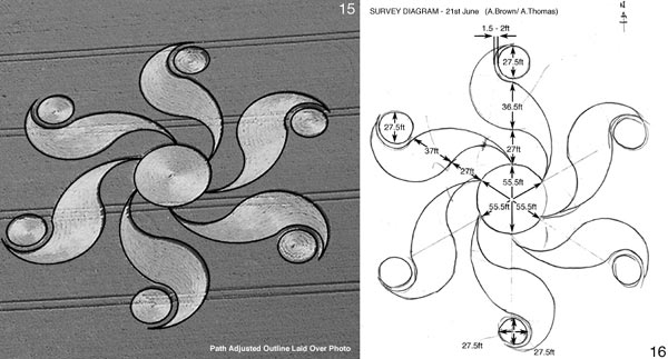
interesting to note that in the Honey Street formation the opening sequence of
steps all unfold as a consequence of the previous steps, so there is a
relatively little deviation from the ideal at this stage. The only steps that
require calculation or measuring are those that determine the centres of the
arcs and circles highlighted in stages 7 through 10. It is exactly these steps
that on the ground result in a noticeable deviation from the ideal and although
no formation we've ever received is flawless in its execution, these small
circles, and the finesse of the crescent tips of the six arms are precisely the
problematic areas one would encounter if one were to try and make this formation
at night in a field. If you study the simple aerial photograph you will notice
the degree of deviation from the ideal exhibited by these six small circles and
the relative thickness of standing arcs of crop that separate the arms from the
circles they encompass. This said, however, when a relatively thick outline is
used to overlay the aerial photo (See Diagram 15) the degree of correspondence
between the ideal and the actual is pretty good, with only the arms at 2 and
4'o'clock respectively showing significant deviation.

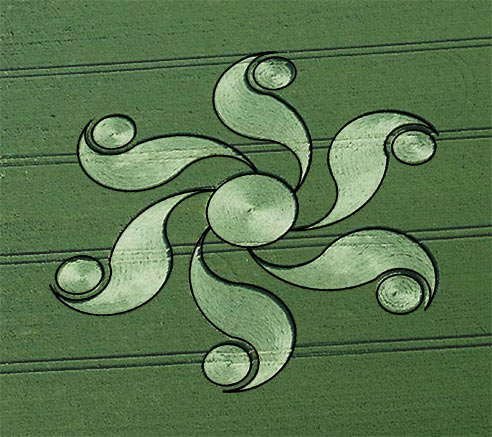
5/ AERIAL PHOTO OF FORMATION
Irrespective of the formations deviation from the
ideal or otherwise, I must point out that I found signs of lateral creasing on
the stems on much of the downed crop, although again I must highlight that I did
not go into this formation until several days after its appearance and I have no
idea as to how many people may have visited the formation in the interim.
However, regardless of origin, I find this a really solid design, and if it was
manually constructed then they have done a remarkably professional job, and the
finished formation is very poignant and beautiful. Every good formation,
regardless of origin, teaches us something new, and this formation is no
exception, although its power certainly emanated from its geometry as opposed to
the nature of how the crop was laid. It was interesting to go from this
formation into the East Field formation which had appeared a day or two before
our visit. From the side of the road the East Field formation jarred my
geometric sensibilities, even though it had a very powerful an immediate visual
impact, yet when inside I found the lay of this formation exquisite. It felt
very fluid and watery and gave the impression of having come down pretty
quickly. Perhaps we were being shown that remarkable geometry is not the be all
and end all of the crop circle mystery, that there exist many ways of conveying
beauty and grace and certainly the East Field formation seems to be a firm
favourite amongst many people, despite the fact, or maybe precisely because of
the fact, it breaks the mould.
When you look at the East Field photo, remember
that the crop flows out from the small circle at the centre of the spiral, in a
clockwise direction, until it meets the smallest of the four thought bubbles,
that in turn connect to the linear path of the formation. This spiral has at
least four centres of curvature, and because it is all emerging in a clockwise
direction from the small centre circle it poses some very difficult construction
problems, like how to locate and get to the centre of this small circle in the
first place. A missed seed drill affords a theoretical path of entry, but the
four thought bubbles that emerge out of the end of the spiral path, are located
precisely on the arc of curvature of this spiral. The fourth and largest of
these thought bubbles would have needed to have been constructed first in order
to locate the missed seed drill entry avenue in the first place, and I think it
would be nearly impossible to work backwards in this fashion and get the spiral
to precisely pass through the centre of the original large thought bubble
circle. Spend a bit of time looking at this and you'll start to get a sense of
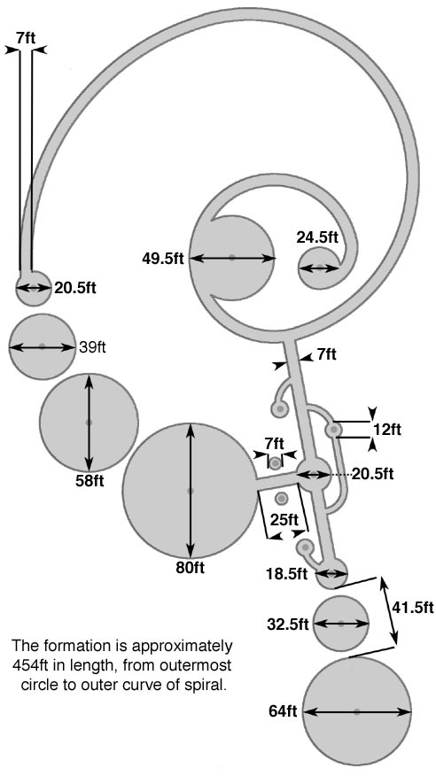
what I mean. The diagram below entitled DIAGRAM 9/ UNDERLYING STRUCTURE shows
the underlying structure I needed to create in order to locate all the centre of
arcs in order to do my silhouette drawing. It's not 100% accurate, but good
enough to convey the subtleties involved. You will also note that the large
circle that makes up the outer portion of the spiral and runs through the
centres of the four thought bubbles, crosses the straight laid axis of the
formation at exactly the centre of curvature of a large circle that, if
rendered, would touch both circles at the ends of this axis.
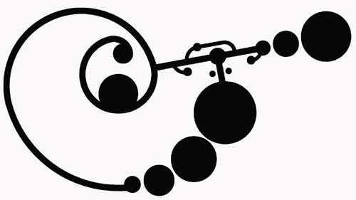
6/ EAST FIELD SILHOUETTE
7/ EAST FIELD AERIAL PHOTO OVERLAID
8/ EAST FIELD SILHOUETTE
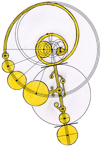
DIAGRAM 9/ UNDERLYING STRUCTURE
Someone writing on the forum relating to the
East Field formation made a wonderful observation, that may not have arisen had
the formation not been accurately surveyed. They noticed that if the diameters
of all the various circles that go to make up the formation are added together,
they equal the total length of the formation along its longest axis. To this
end I must point out that the circle marked as measuring 12ft was a an
estimation, and the other two unlabelled circles were also not measured, so
this correlation may actually be extremely accurate. It is unexpected insights
such as this that make the travails of surveying all worth while.
Credit to Steve Alexander and all the other
photographers for providing such good overhead images, without which much of
this work would simply just not be possible.
|